
A transformation that had stopped moving
Rebrand, cross-platform design system, product evolution, and technical restructuring, all at once. More than 100 people in motion, on a fixed clock: the Olympic Games Paris 2024.
More than a year in, delivery had stalled and design was the bottleneck. The causes were structural: no clear ownership across platforms, no shared definition of ready or done, and senior designers spread thin. I was brought in to restore predictability without destabilizing the program further.
Stabilize first, improve second
1 · Concentrate senior capacity on the critical path
I put the experienced designers on the initiatives that could sink the timeline and moved lower-risk work to juniors. The critical path stopped slipping, and the juniors built confidence without blocking delivery.
2 · Make the delivery rules explicit
I wrote one operating model for every team: a Definition of Ready, a Definition of Done, design-system-backed acceptance criteria, and daily rituals with Engineering.
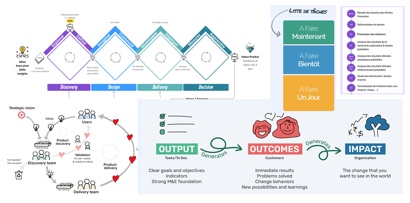
3 · Align sequencing with reality
I rebuilt the roadmap on honest estimates and explicit trade-offs, and re-cut planning from 3-month cycles to 6-week Program Increments.
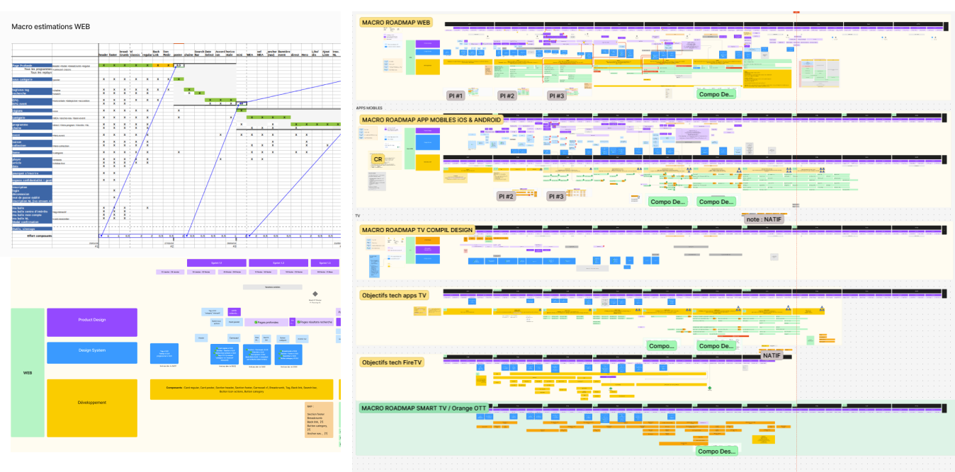
One system, holding 3 platforms together
I led the build of a design system from scratch. It carried the rebrand onto every surface, holding structure, art direction, and interaction consistent across web, mobile, and TV. It ran on governance: contribution rules, review gates, and adoption tracked across teams.

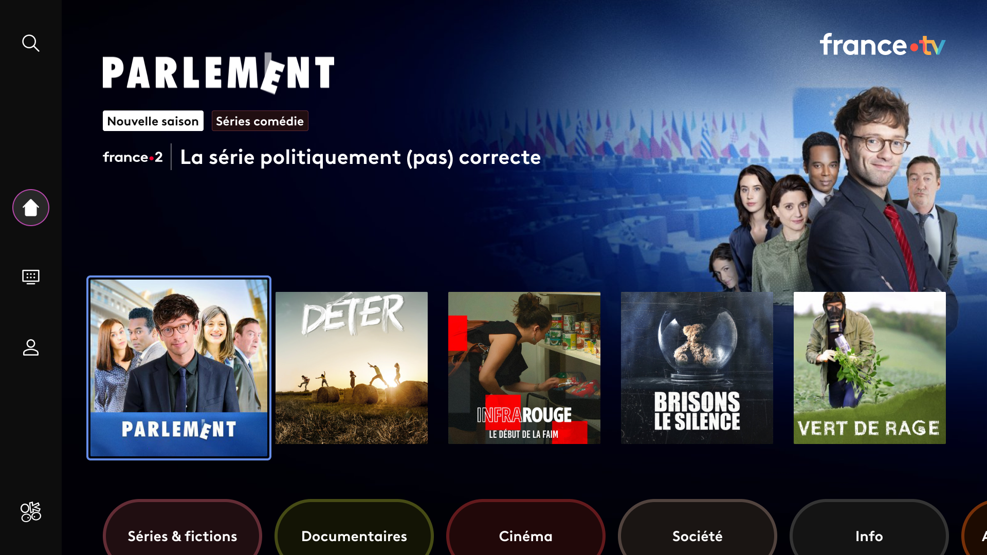
Rebuilt for the living room
The TV home after the redesign: one of three platforms rebuilt on a single cross-platform system.
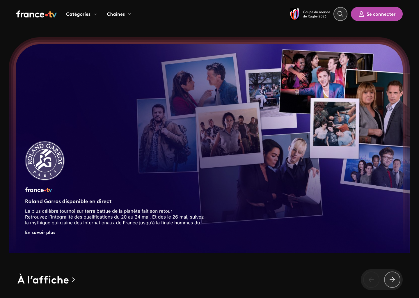
The front door
The web home: the front door of France’s #1 free streaming platform, roughly 36 million visitors a month.
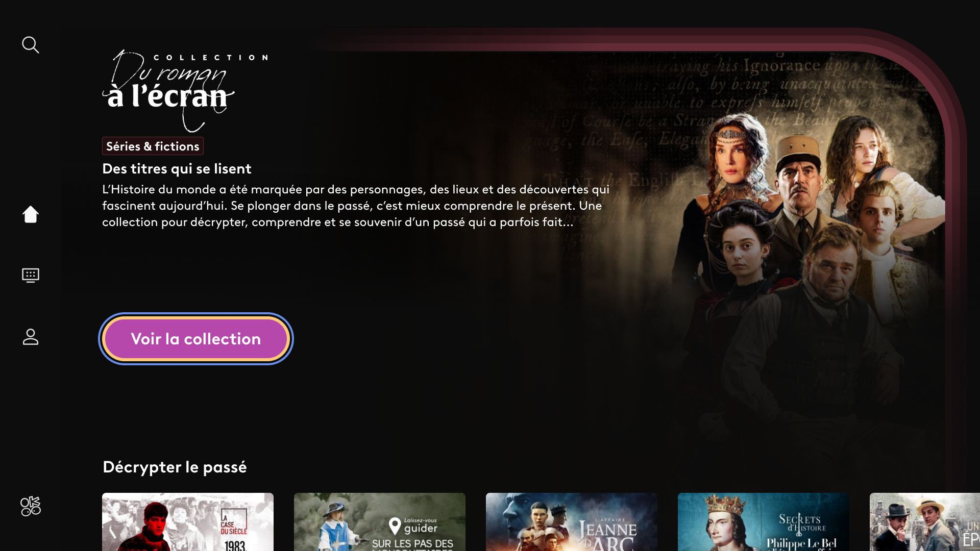
Art direction, systematised
Editorial collections carry premium art direction, held by the design system, with no one-off custom builds.

One player, every surface
One player serves france.tv, franceinfo, and the regional platforms: built once, governed centrally.
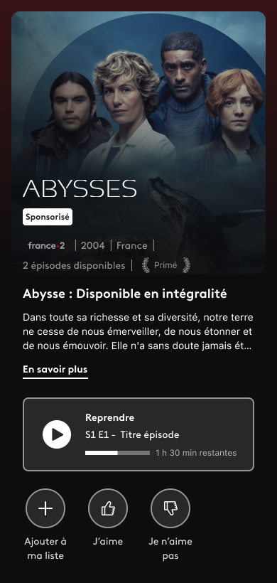
Mobile, on the same bones
The mobile program page sits on the same information structure as web and TV: one model, three form factors.